I want to take you behind the scenes of a recently completed piece, "Swarm".
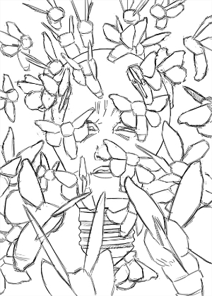
The initial rough sketch:
The maquette:
With the maquette, I printed out the wings from an image of a silk moth and glued it to a wire body. I then glued cotton onto the wire and tied string to restrain the fluff in key areas. The legs are twisted paper, which in hindsight, would have benefited from a little more attention to accuracy.
The reference photos:
There are a lot more where these came from.
I set up a light to photograph my moths to get a sense of scale. The brightness of the light made my photos over-exposed, so I printed out a photo of a light bulb onto some thick cardstock and taped it in front of the actual light. I didn't end up needing the lighting information in the end since I went with a graphic rendering for the moths. Oh well! It still looks cool.
The photo montage:
I took my photo reference and pasted the moths directly onto their spots in the initial thumbnail. It was nice being able to move around the different layers and fine-tune the moths' positioning.
The refined drawing:
I made some more precise line art, which I drew digitally and printed out to trace onto my drawing surface.
The 3D model:
Like I mentioned before, I didn't make very accurate legs for my maquette, so I made a 3D sculpt. It also made for some better reference for the head.
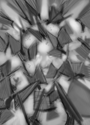
The value study:
This piece was intended to be finished as-is, which can explain the high level of polish. I decided later that I wanted to create a larger digital version with some added detail in areas like the wings.
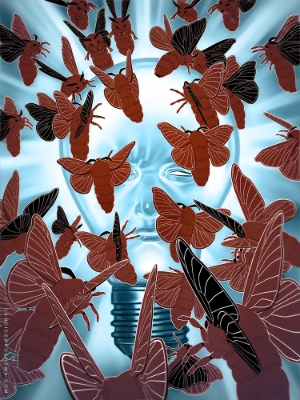
The final illustration:
I painted directly on top of the traditional piece, making small improvements along the way. Adding the wing veins was a little tedious, but I was able to use one set of lines that I transformed (using "distort") to fit all of the different angles. I went with a smooth surface for the light bulb and added a paper texture to the moths to give it more visual interest, especially in close-up views.


